Dashboard
@sme-uploader/dashboard is a universal UI plugin for SME Uploader, offering several useful features:
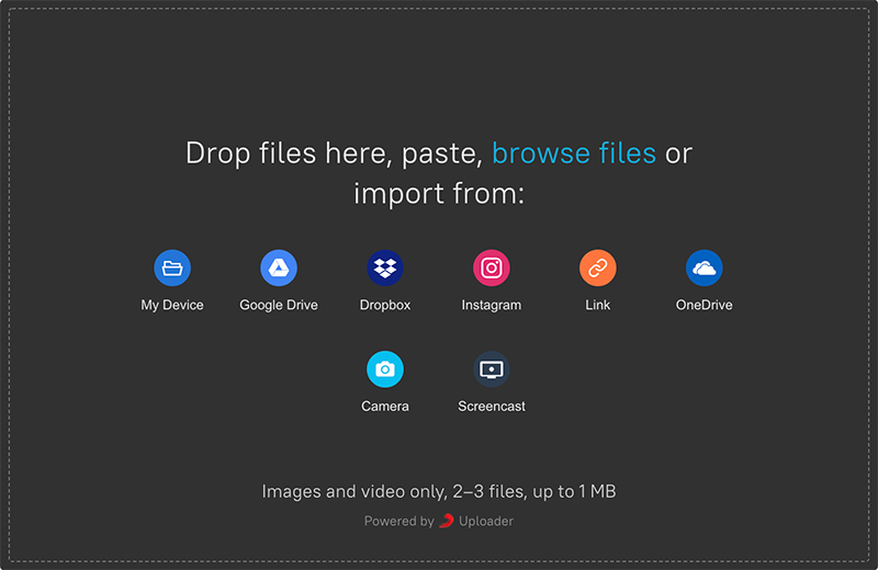
- Drag and drop, paste, select from local disk / my device
- UI for the Webcam plugin and remote sources, such as Google Drive, Dropbox, Instagram, Facebook and OneDrive (all optional, added via plugins)
- Image previews
- Metadata editor
- Upload progress
- Ability to pause or cancel (depending on the uploader plugin) uploads
const Dashboard = require('@sme-uploader/dashboard') uploader.use(Dashboard, { // Options }) |
Installation
This plugin is published as the @sme-uploader/dashboard package.
Install from NPM:
npm install @sme-uploader/dashboard |
In the CDN package, it is available on the SmeUploader global object:
const Dashboard = SmeUploader.Dashboard |
CSS
The @sme-uploader/dashboard plugin requires the following CSS for styling:
import '@sme-uploader/core/dist/style.css' import '@sme-uploader/dashboard/dist/style.css' |
Import general Core styles from @sme-uploader/core/dist/style.css first, then add the Dashboard styles from @sme-uploader/dashboard/dist/style.css. A minified version is also available as style.min.css at the same path. The way to do import depends on your build system.
⚠️ The
@sme-uploader/dashboardplugin includes CSS for the Dashboard itself, and the various plugins used by the Dashboard, such as (@sme-uploader/status-barand@sme-uploader/informer). If you also use the@sme-uploader/status-baror@sme-uploader/informerplugin directly, you should not include their CSS files, but instead only use the one from the@sme-uploader/dashboardplugin.
Styles for Provider plugins, like Google Drive and Instagram, are also bundled with Dashboard styles. Styles for other plugins, such as @sme-uploader/url and @sme-uploader/webcam, are not included. If you are using those, please see their docs and make sure to include styles for them as well.
Options
The Dashboard can be extensively customized by configuring the options below to your liking:
uploader.use(Dashboard, { id: 'Dashboard', target: 'body', metaFields: [], trigger: '#uploader-select-files', inline: false, width: 750, height: 550, thumbnailWidth: 280, defaultTabIcon: defaultTabIcon, showLinkToFileUploadResult: true, showProgressDetails: false, hideUploadButton: false, hideRetryButton: false, hidePauseResumeButton: false, hideCancelButton: false, hideProgressAfterFinish: false, note: null, closeModalOnClickOutside: false, closeAfterFinish: false, disableStatusBar: false, disableInformer: false, disableThumbnailGenerator: false, disablePageScrollWhenModalOpen: true, animateOpenClose: true, fileManagerSelectionType: 'files', proudlyDisplayPoweredBySmeUploader: true, onRequestCloseModal: () => this.closeModal(), showSelectedFiles: true, showRemoveButtonAfterComplete: false, locale: defaultLocale, browserBackButtonClose: false, theme: 'light' }) |
id: 'Dashboard'
A unique identifier for this plugin. It defaults to 'Dashboard', but you can change this if you need multiple Dashboard instances.
Plugins that are added by the Dashboard get unique IDs based on this ID, like 'Dashboard:StatusBar' and 'Dashboard:Informer'.
target: 'body'
Dashboard is rendered into body, because it is hidden by default and only opened as a modal when trigger is clicked.
inline: false
By default, Dashboard will be rendered as a modal, which is opened by clicking on trigger. If inline: true, Dashboard will be rendered into target and fit right in.
trigger: '#uploader-select-files'
String with a CSS selector for a button that will trigger opening the Dashboard modal. Multiple buttons or links can be used, as long as it is a class selector (.uploader-choose, for example).
plugins: []
List of plugin IDs that should be shown in the Dashboard’s top bar. For example, to show the Webcam plugin:
uploader.use(Webcam) uploader.use(Dashboard, { plugins: ['Webcam'] }) |
Of course, you can also use the target option in the Webcam plugin to achieve this. However, that does not work with the React components. The target option may be changed in the future to only accept DOM elements, so it is recommended to use this plugins array instead.
width: 750
Width of the Dashboard in pixels. Used when inline: true.
height: 550
Height of the Dashboard in pixels. Used when inline: true.
waitForThumbnailsBeforeUpload: false
Whether to wait for all thumbnails from @sme-uploader/thumbnail-generator to be ready before starting the upload. If set to true, Thumbnail Generator will envoke SME Uploader’s internal processing stage, displaying “Generating thumbnails…” message, and wait for thumbnail:all-generated event, before proceeding to the uploading stage.
This is useful because Thumbnail Generator also adds EXIF data to images, and if we wait until it’s done processing, this data will be avilable on the server after the upload.
showLinkToFileUploadResult: true
By default, when a file upload has completed, the file icon in the Dashboard turns into a link to the uploaded file. If your app does not publicly store uploaded files or if it’s otherwise unwanted, pass showLinkToFileUploadResult: false.
showProgressDetails: false
Passed to the Status Bar plugin used in the Dashboard.
By default, progress in Status Bar is shown as a simple percentage. If you would like to also display remaining upload size and time, set this to true.
showProgressDetails: false: Uploading: 45%showProgressDetails: true: Uploading: 45%・43 MB of 101 MB・8s left
hideUploadButton: false
Passed to the Status Bar plugin used in the Dashboard.
Hide the upload button. Use this if you are providing a custom upload button somewhere, and using the uploader.upload() API.
hideRetryButton: false
Hide the retry button in StatusBar (the progress bar below the file list) and on each individual file.
Use this if you are providing a custom retry button somewhere, and using the uploader.retryAll() or uploader.retryUpload(fileID) API.
hidePauseResumeButton: false
Hide the pause/resume button (for resumable uploads, via tus, for example) in StatusBar and on each individual file.
Use this if you are providing custom cancel or pause/resume buttons somewhere, and using the uploader.pauseResume(fileID) or uploader.removeFile(fileID) API.
hideCancelButton: false
Hide the cancel button in StatusBar and on each individual file.
Use this if you are providing a custom retry button somewhere, and using the uploader.cancelAll() API.
hideProgressAfterFinish: false
Hide Status Bar after the upload has finished.
showSelectedFiles: true
Show the list (grid) of selected files with preview and file name. In case you are showing selected files in your own app’s UI and want the SME Uploader Dashboard to just be a picker, the list can be hidden with this option.
See also disableStatusBar option, which can hide the progress and upload button.
showRemoveButtonAfterComplete: false
Sometimes you might want to let users remove an uploaded file. Enabling this option only shows the remove X button in the Dashboard UI, but to actually send a request you should listen to file-removed event and add your logic there.
uploader.on('file-removed', (file, reason) => { if (reason === 'removed-by-user') { sendDeleteRequestForFile(file) } }) |
note: null
Optionally, specify a string of text that explains something about the upload for the user. This is a place to explain any restrictions that are put in place. For example: 'Images and video only, 2–3 files, up to 1 MB'.
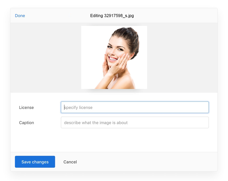
metaFields: []
An array of UI field objects that will be shown when a user clicks the “edit” button on that file. Configuring this enables the “edit” button on file cards. Each object requires:
id, the name of the meta field. Note: this will also be used in CSS/HTML as part of theidattribute, so it’s better to avoid using characters like periods, semicolons, etc.name, the label shown in the interface.placeholder, the text shown when no value is set in the field. (Not needed when a custom render function is provided)
Optionally, you can specify render: ({value, onChange}, h) => void, a function for rendering a custom form element.
It gets passed ({value, onChange}, h) where value is the current value of the meta field, onChange: (newVal) => void is a function saving the new value and h is the createElement function from preact.h can be useful when using uploader from plain JavaScript, where you cannot write JSX.
.use(Dashboard, { trigger: '#pick-files', metaFields: [ { id: 'name', name: 'Name', placeholder: 'file name' }, { id: 'license', name: 'License', placeholder: 'specify license' }, { id: 'caption', name: 'Caption', placeholder: 'describe what the image is about' }, { id: 'public', name: 'Public', render: function({value, onChange}, h) { return h('input', { type: 'checkbox', onChange: (ev) => onChange(ev.target.checked ? 'on' : 'off'), defaultChecked: value === 'on' }) } } ] }) |
Note that this metadata will only be set on a file object if it is entered by the user. If the user doesn’t edit a file’s metadata, it will not have default values; instead everything will be undefined. If you want to set a certain meta field to each file regardless of user actions, set meta in the SME Uploader constructor options.
closeModalOnClickOutside: false
Set to true to automatically close the modal when the user clicks outside of it.
closeAfterFinish: false
Set to true to automatically close the modal when all current uploads are complete. You can use this together with the allowMultipleUploads: false option in SME Uploader Core to create a smooth experience when uploading a single (batch of) file(s).
With this option, the modal is only automatically closed when uploads are complete and successful. If some uploads failed, the modal stays open so the user can retry failed uploads or cancel the current batch and upload an entirely different set of files instead.
Setting
allowMultipleUploads: falseis strongly recommended when using this option. With multiple upload batches, the auto-closing behavior can be very confusing for users.
disablePageScrollWhenModalOpen: true
Page scrolling is disabled by default when the Dashboard modal is open, so when you scroll a list of files in SME Uploader, the website in the background stays still. Set to false to override this behaviour and leave page scrolling intact.
animateOpenClose: true
Add light animations when the modal dialog is opened or closed, for a more satisfying user experience.
fileManagerSelectionType: 'files'
Configure the type of selections allowed when browsing your file system via the file manager selection window. May be either ‘files’, ‘folders’, or ‘both’. Selecting entire folders for upload may not be supported on all browsers.
proudlyDisplayPoweredBySmeUploader: true
SME Uploader is provided to the world for free by the team behind Transloadit. In return, we ask that you consider keeping a tiny SME Uploader logo at the bottom of the Dashboard, so that more people can discover and use SME Uploader.
This is, of course, entirely optional. Just set this option to false if you do not wish to display the SME Uploader logo.
disableStatusBar: false
Dashboard ships with the StatusBar plugin that shows upload progress and pause/resume/cancel buttons. If you want, you can disable the StatusBar to provide your own custom solution.
disableInformer: false
Dashboard ships with the Informer plugin that notifies when the browser is offline, or when it is time to say cheese if Webcam is taking a picture. If you want, you can disable the Informer and/or provide your own custom solution.
disableThumbnailGenerator: false
Dashboard ships with the ThumbnailGenerator plugin that adds small resized image thumbnails to images, for preview purposes only. If you want, you can disable the ThumbnailGenerator and/or provide your own custom solution.
locale: {}
Localize text that is shown to the user.
The Dashboard also contains the @sme-uploader/status-bar plugin by default, which has its own strings. Strings for the Status Bar can also be specified in the Dashboard locale.strings option, and will be passed down. They are not all listed below—see the @sme-uploader/status-bar documentation pages for the full list.
The default English strings are:
strings: { // When `inline: false`, used as the screen reader label for the button that closes the modal. closeModal: 'Close Modal', // Used as the screen reader label for the plus (+) button that shows the “Add more files” screen addMoreFiles: 'Add more files', // TODO addingMoreFiles: 'Adding more files', // Used as the header for import panels, e.g., “Import from Google Drive”. importFrom: 'Import from %{name}', // When `inline: false`, used as the screen reader label for the dashboard modal. dashboardWindowTitle: 'SME Uploader Dashboard Window (Press escape to close)', // When `inline: true`, used as the screen reader label for the dashboard area. dashboardTitle: 'SME Uploader Dashboard', // Shown in the Informer when a link to a file was copied to the clipboard. copyLinkToClipboardSuccess: 'Link copied to clipboard.', // Used when a link cannot be copied automatically — the user has to select the text from the // input element below this string. copyLinkToClipboardFallback: 'Copy the URL below', // Used as the hover title and screen reader label for buttons that copy a file link. copyLink: 'Copy link', // Used as the hover title and screen reader label for file source icons, e.g., “File source: Dropbox”. fileSource: 'File source: %{name}', // Used as the label for buttons that accept and close panels (remote providers or metadata editor) done: 'Done', // TODO back: 'Back', // Used as the screen reader label for buttons that remove a file. removeFile: 'Remove file', // Used as the screen reader label for buttons that open the metadata editor panel for a file. editFile: 'Edit file', // Shown in the panel header for the metadata editor. Rendered as “Editing image.png”. editing: 'Editing %{file}', // Text for a button shown on the file preview, used to edit file metadata edit: 'Edit', // Used as the screen reader label for the button that saves metadata edits and returns to the // file list view. finishEditingFile: 'Finish editing file', // TODO saveChanges: 'Save changes', // Used as the label for the tab button that opens the system file selection dialog. myDevice: 'My Device', // Shown in the main dashboard area when no files have been selected, and one or more // remote provider plugins are in use. %{browse} is replaced with a link that opens the system // file selection dialog. dropPasteImport: 'Drop files here, paste, %{browse} or import from', // Shown in the main dashboard area when no files have been selected, and no provider // plugins are in use. %{browse} is replaced with a link that opens the system // file selection dialog. dropPaste: 'Drop files here, paste or %{browse}', // TODO dropHint: 'Drop your files here', // This string is clickable and opens the system file selection dialog. browse: 'browse', // Used as the hover text and screen reader label for file progress indicators when // they have been fully uploaded. uploadComplete: 'Upload complete', // TODO uploadPaused: 'Upload paused', // Used as the hover text and screen reader label for the buttons to resume paused uploads. resumeUpload: 'Resume upload', // Used as the hover text and screen reader label for the buttons to pause uploads. pauseUpload: 'Pause upload', // Used as the hover text and screen reader label for the buttons to retry failed uploads. retryUpload: 'Retry upload', // Used as the hover text and screen reader label for the buttons to cancel uploads. cancelUpload: 'Cancel upload', // Used in a title, how many files are currently selected xFilesSelected: { 0: '%{smart_count} file selected', 1: '%{smart_count} files selected' }, // TODO uploadingXFiles: { 0: 'Uploading %{smart_count} file', 1: 'Uploading %{smart_count} files' }, // TODO processingXFiles: { 0: 'Processing %{smart_count} file', 1: 'Processing %{smart_count} files' }, // The "powered by SME Uploader" link at the bottom of the Dashboard. // **NOTE**: This string is called `poweredBy2` for backwards compatibility reasons. // See https://github.com/transloadit/uploader/pull/2077 poweredBy2: 'Powered by %{uploader}', // @sme-uploader/status-bar strings: uploading: 'Uploading', complete: 'Complete' // ...etc } |
replaceTargetContent: false
Remove all children of the target element before mounting the Dashboard. By default, SME Uploader will append any UI to the target DOM element. This is the least dangerous option. However, there might be cases when you would want to clear the container element before placing SME Uploader UI in there (for example, to provide a fallback <form> that will be shown if SME Uploader or JavaScript is not available). Set replaceTargetContent: true to clear the target before appending.
theme: 'light'
SME Uploader Dashboard supports “Dark Mode”. You can try it live on the Dashboard example page.
There are three options:
light— the defaultdarkauto— will respect the user’s system settings and switch automatically
Methods
openModal()
Shows the Dashboard modal. Use it like this:
uploader.getPlugin('Dashboard').openModal()
closeModal()
Hides the Dashboard modal. Use it like this:
uploader.getPlugin('Dashboard').closeModal()
isModalOpen()
Returns true if the Dashboard modal is open, false otherwise.
const dashboard = uploader.getPlugin('Dashboard') if ( dashboard.isModalOpen() ) { dashboard.closeModal() } |
Events
dashboard:modal-open
Fired when the Dashboard modal is open.
uploader.on('dashboard:modal-open', () => { console.log('Modal is open') }) |
dashboard:modal-closed
Fired when the Dashboard modal is closed.
dashboard:file-edit-start
Fired when the user clicks “edit” icon next to a file in the Dashboard. The FileCard panel is then open with file metadata available for editing.
dashboard:file-edit-complete
Fired when the user finished editing the file metadata.